Design 8: 04. Laying out an App Page – Part 1

Post Header

Laying out an App Page – Part 1

After knowing more about the controls, when to use them, and how to add them to the App UI, Now I’ll go deeper in how to arrange them inside the app page and build a consistent UI that is flexible for different screen resolutions. First thing to know is that there’re types of layout settings parameters for the UI controls:

  1. General parameters for any containing control: Alignment and Margin.
  2. Special parameters for some containing controls: such as: Row, RowSpan for the Grid control.
  3. Parameters for the controls itself: such as: Padding, FlowDirection

Let’s start with the first one:

1.     General parameters for any containing control:

  • Alignment: there’s ways for aligning a control inside its containing  control
    • Horizontal: whether you can align the control to the left, center, right, or stretching it horizontally over the containing control (Horizontal Stretching works when you give the control’s width and “Auto” value).

Horizontal Alignment 

    • Vertical: whether you can align the control to the top, center, bottom, or stretching it vertically over the containing control (Vertical Stretching works when you give the control’s height an “Auto” value).

 Vertical Alignment

  • Margin: Setting the space that would be free around the control from the 4 directions.

 Margin

So now, let’s try using those two parameters. Here’re two samples:

1. Centralizing a button inside a grid with no Margin setting

Centralizing

Centralizing output 


2. Stretch a button and giving it a 120px margin from the left, 40px from the top and the bottom, and 80px from the right:

 Stretching

Stretching output


Now let’s jump to the next type of parameters.

2.     Special parameters for some containing control:

  • Grid: The Grid controls is considered as one of the most important UI controls here as it features dividing it into rows and columns which allows building a flexible layout that works on different screen resolutions. Let’s see how we can implement this:

We can give the row or the column a value out of 3 types:

  1. Pixels: when we want the row or the column take an actual number of pixels in any screen resolution.
  2. Star: when we want to distribute the available (non-taken) space of a grid by weighted proportions.
  3. Auto: When we need the row or the column fit their content even if the content size is matter to change.Let’s practice now these types:I’ll create a layout where there’re:
      • 120px free space from the left.
      • 200×200 rectangle that is centralized vertically.
      • Two rectangles, one of them is 2x bigger than the other and each one have 20px left margin and 200px top and bottom margin

Steps:

1. Let’s define the columns needed by clicking on the upper side of the grid when the orange line appears. Here, we will need 4 columns so, we’ll add 3 column definitions and give the 4 columns resulted the following values from the pop up that appears when we hover above any column and choose the value from the drop-down list that appears by clicking the small arrow:

Adding column

      • 1st column: 120 and choose the value by pixels.
      • 2nd column: let’s choose the value by “Auto”. It’ll seem to be empty, that’s normal so don’t panic.
      • 3rd column: let’s give it 1 and the value is by Star.
      • 4th column: give it 2 and the value by Star to be 2x bigger than the 3rd column.

2. Now, let’s add the controls and layout them:

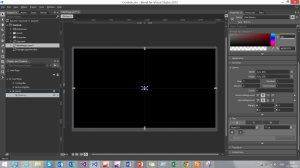
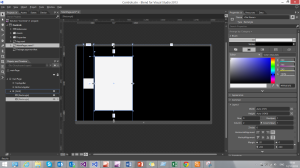
      • Let’s add a rectangle, give it 200×200 width and height. And set the column by 1 to lay it in the 2nd column that we set before by Auto, then set its vertical alignment to center. Now we will mention that the hidden column appears and takes 200px size. Try to change the size of its content by changing the width of the rectangle or giving it left or right margins.

Adding first rectangle 

      • Add a rectangle, set its width and height to Auto, lay it out in the 2nd column, stretch it vertically and horizontally, then give it the following margins: 20px left, 200px top and bottom

 Adding second rectangle

      • Finally, add the last rectangle, set its width and height to auto, lay it out in the 3rd column, stretch it vertically and horizontally, and give it the same margins of the previous rectangle.

 Adding third rectangle

Now let’s run and see the output layout:

Final layout

That’s for now. In the next post I’ll continue talking starting from the StackPanel control parameters so, stay tuned and keep practicing and if you have any question or any feedback that will be more than welcomed. Don’t hesitate to drop me an e-mail: ab.alnady@hotmail.com

Design 8: 03 – Controls – Part 4

Post Header

3 Ways to add controls

After explaining and telling when to use the controls, now it’s the time to use them! Terrific! Some people say that there’s more than one way to add controls to the UI. Yeah! That’s true.

1. First way: Write the code of the controls in the XAML editor

In Visual Studio and Blend there’s a text editor for XAML to write, edit, and maintain the XAML code for your UI and its resources (Styles, DataTemplates, Animation Storyboards, …etc.).

Visual Studio Editor

So, If we want to add a Button control inside a Grid Container we just type the lines of codes of these controls in XAML in this editor by defining their tags and the properties we’d like for each control inside its tag such as Height, Weight, Alignment, …etc.

    <Grid Height="auto"
          Width="auto"
          HorizontalAlignment="Stretch"
          VerticalAlignment="Stretch">

        <Button Width="100"
                Height="50"
                Content="Hello"
                VerticalAlignment="Center"
                HorizontalAlignment="Center" />
    </Grid>

Continue reading

Design 8: 03 – Controls – Part 3

Part 3 Header

Controls that carry items/Text Controls/Progress Indicators/Display & Media Controls

               Let’s continue now and jump to the other types of Windows Store Controls. In the previous two parts of the Controls Section in Design 8 I’ve talked about many types of controls: Container/Layout panel, Action Controls, Date/Time Controls, Flyout/Menus Controls, and Progress Controls. Now I’m going to talk about the other types of controls. Let’s start with the first one:

Controls that carry items

  • ComboBox:
    • Type: Selection Control
    • Usage: When you want to display a list of items inside a dropdown list Continue reading

Design 8: 03 – Controls – Part 2

Part 2 Header

Controls – Action/Date & Time/ Flyout & Menus Controls

                The talk about Windows 8.1 controls is still on. In the previous post I’ve talked about a category of controls that was made to contain other controls. I’ll continue in the post with other different types of controls: Action controls, Date/Time controls, and Flyouts and Menus controls.

 Controls Part 2

Action Controls

  • Button:

    • Type: Action Control
    • Usage: When you need to respond to user input and raise a Click event. Continue reading

Design 8: 03 – Controls – Part 1

Part 1 Header

Controls – Containers/Layout panels

All what the users see is a UI control that you place and manage its layout in the App Design so, it’s really important to know more about the controls of the platform that you’re working on. In Windows 8.1, there’re many types of cool controls that you can use in the design. I’ll brief the most important about Windows 8.1 controls and how to add a control to the UI. To be more design oriented, I’ll categorize the Windows 8.1 controls upon its main functionality:

Container/Layout panel:

Containers - Layout Panels

  • Border

    • Type: Container
    • Usage: When you need to surround an object with a border with a determined Thickness, it also takes a background color.
    • Note that it can only carry on object. Continue reading

Design 8: 02- Blend – The Design Giant

Post Header

Blend:

After discovering the templates that we should work on, including the blank template where we create our design from scratch, We should now get started with the tool that we will work on. THE DESIGN GIANT: BLEND 

At first, Blend was a part of the Microsoft Expression Studio Package under the name of Expression Blend. For some reason, Microsoft didn’t release any update of this package after the 4th edition. But it was a must to update Blend for its high need in designing Apps for Windows Phone and Windows 8. So, Microsoft solved this by integrating the Blend software with the Microsoft Visual Studio installation so that, developer can get all the needed tools once a time. 

Let’s open now Blend and get started with it, I’ll divide it into many points:

1. Workspace:

In Blend there’re two workspaces to work on:

    1. Design (Default).
    2. Animation. And I think that their names explains their functionality.

    Screenshot (10)

    Continue reading

    Design 8: 01- Creating a new project – App Templates

    Post 1 Header

    Back!

    Here we go with the first post of “Design 8” series. In the previous post I’ve introduced you to the series, now we’re about to start talking technically. During this series, I’ll work on Visual Studio + Blend and taking the track of C# + XAML for Windows Store Apps.

    In this post, I’ll start from the File>New>Project point. So let’s start now and talk see appears when we clicked New Project.

    First thing we see in the Windows Store tab is the templates that Microsoft provides for the developers. For Windows 8.1 + Visual Studio 2013, Microsoft provided the developers with 4 templates to work with. These templates are a very good raw material for the developer to work on, customize, and learn from as it gives you the opportunity to have a look of an App that is written by the hands of the technology maker itself.

    Let’s that look on those 4 templates:

    New Project

    1. Blank App: An app that contains only one page that is … Blank 😀
    2. Grid App: An App for displaying grouped items with their dedicated data in 3 pages. The main page is for the grouped items view, another page for the group data, and the third for the item data.
    3. Split App: An App for displaying grouped items too but contains only 2 pages. The main page is to choose a group from a grid of items, and the other one is divided equally into two parts, a part to choose the item from and the other is to display the details of the selected item from.
    4. Hub App: This App template leverages the Hub control that beautifully came with Windows 8.1. There’re many apps that depend on that control to display its main view such as: News, Travel, Food & Drink, and Health & Fitness.

    Continue reading

    Design 8: 00 – Introduction

    Design 8 Logo

    Hello!

    Welcome to the first post of the “Design 8” series that will help you create a better UI for your Windows Store App and leverage the User Experience of the App by applying the Microsoft Modern Design Style. InDesign 8” I prefer not only to provide practical practices, but also, I’ll demonstrate and discuss the main theoretical points of the UX design that will help us diving deep in the UX field to get the best of the theories to the surface of the UI Implementation. Design 8 will not only be published as blog posts but don’t worry about this now, I prefer to surprise you. Anyway, stay tuned! Capture Microsoft made it more than easy to produce a good quality App simply by separating the design progress and the development progress. In Windows 8.1 and Windows Phone, those who design work with the markup files that shows the UI of the App and those who develop work with the code-behind files that contain the logic of the App. And this separation is achieved perfectly in the tools used to produce the App. It’s known that the developer mainly work on that giant Visual Studio but Microsoft also presents powerful tool to the designer to work with.

    Tools:

    Blend for Visual Studio: Blend is a very powerful design software that enables designers to create Hi-Quality UI with many design features. There’re also many tools that add an extension features and works perfectly with Blend such as Microsoft Expression Design and the XAML Project. I’ll introduce both of them to you and explain how to get the best of them.

               Screenshot (1) Screenshot (2)        The XAML Project-23 

    That’s for now, wait the next post that will be about starting designing your Windows Store App from Scratch. If there’re any question or any feedback that will be more than welcomed. Don’t hesitate to drop me an e-mail: ab.alnady@hotmail.com